Great Color Combinations &
European-Inspired Interior Design Color Schemes
Great color combinations, grouped by color family: Just click a pic for the best color combinations to color a room, decorate, or accessorize. (Works for fashion, too :-) Full-on or subtle, your choice!
If you know where to look, you can find the best color combinations in all kinds of weird and wonderful places.
From shop windows to cottage gardens to an accidental stack of t-shirts in your closet ...
... there's inspiration for great color combinations all around us.
If, unlike me, you're more of an organized type, check out the page about complementary & split complementary colors on the color wheel. Complementaries are a great starting point when you're looking for what-color-goes-with-what.
This page has great color combinations for every basic hue, and then some. I suggest you either click a color link (above), or read through the ideas list for great color combinations (below).
Youll also find tips for the right proportions for room paint colors & interior design color schemes (further down this page - click the link or scroll!)
1. Interior Color Schemes Combination Chart
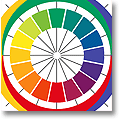
The following home decorating color schemes and wall color combinations are organized around the 4-primary color wheel (which is a goldmine for design & interior color combinations): red, blue, green, yellow, plus a few notes about neutral color schemes.
1a) The Best Color Combinations With RED
![]()
Wall color combinations with red depend very much on the specific hue of red; many reds need balancing with a less intense, cooler color.
Some of the best color combinations with red (mostly from England/Ireland):
- Tomato: pale olive / cream / cerulean or cobalt blue
- Fire Engine: grayish mauve / plum / dusky apple green / white
- Cranberry: moss / burnt orange / sage / silver gray
- Brick: cool pink / greenish brown / deep bruised purple
- Strawberry: mocha / caffé latte / pistachio / cream
- Cherry: fennel green / milky white / deep burgundy
- Check out a photo gallery of red bedrooms;
- View a collection of red color palette swatches, and ...
- ... understand the psychological effects of red color!
![]()
Pink is the only tint of a primary color that comes with its own name! The color pink is used a lot in France, as well as along the Mediterranean coast (both on the European and the African side).
- Cool pink: antique pewter / laurel green / magenta
- Warm pink: deep plum / dusty turquoise / pale yellow / charcoal
- 'Peachy' pink: cornflower blue / cream / blue-green / chartreuse
- Pale powdery pink: indigo / green-tinged bronze / burnt sienna
- Here are some photos of elegant, contemporary and romantic pink bedrooms;
- View color swatch combinations with pink, and/or
- read up on the psychological effects of the color pink, too!
1b) Great Color Combinations With BLUE
![]()
Purple can be mixed from the primary colors blue and red. It sits between these two on the color mixing wheel and can be either warm (reddish) or cool (bluish). You'll find a lot of dusky purple and aubergine tones in the southern half of France (from Paris to Provence). It combines beautifully with grey and golden sandstone colors.
Some great color combinations with purple:
- Pale violet: tomato red / light icy blue / pale greenish gray
- Burgundy: mustard / bright olive / ice blue / charcoal
- Magenta: royal blue / cognac / antique bronze / vanilla ice cream
- Plum: lime green / pale cobalt blue / winter white
- Check out examples of interior color combinations with purple!
- Here's a collection of purple bedroom decorating photos.
- (The psychological effects of purple are worth a look as well.)
![]()
Blue is everybody's favorite color. It is incredibly versatile and can be mixed into most color combinations. It is often thought of as a Skandinavian (particularly Swedish) or a maritime color, but we all love blue here in Europe! After all, it makes up 1/3 of many of our flags, including the British, Dutch, Swedish & French ones.
Great interior design color schemes with blue:
- Navy: goes with everything. Absolutely everything.
- Pale powder blue: dark brown / white / warm gray (midtones)
- Aqua: dove gray / deep blue iris / desert sand (looks fabulous!)
- Wedgwood blue: milk chocolate / dark, deep raspberry / light gray / milky white
- Ultramarine: dusty turquoise / burnt orange / warm gray
- For visual examples of blue color schemes, click here!
- Blue-and-white bedroom decorating can complement many different styles, and true-blue bedrooms can go from glam to rustic.
- Also, read up on the psychological effects of the color blue (it's all good ;-)
1c) Great Color Combinations With GREEN
![]()
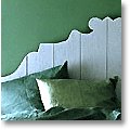
On a wall, green can look flat and fake, unless the paint is alive with subtle undertones. Combines very well with blue or with red. Bluish and emerald greens were paramount in Victorian interiors, and traditional Irish homes often combine a warm green with scarlet, which looks absolutely striking.
Some of the best color combinations with green:
- Jade: pomegranate / ivory / light Delft blue / cream
- Deep forest green: it's just like navy - add whatever you want!
- Mint: dark chocolate / deep turquoise / very pale lavender
- Olive green: orange, aqua
- Moss: bluish-gray green (the color of fresh hay) / burnt umber or spicy chocolate brown
- A green bedroom can look soothing, fresh, regal or cool & contemporary.
- Wondering what else to do with shades of green color? Check out the color combination swatches, and ...
- ... study the psychological effects of green color, too.
1d) Great Color Combinations With YELLOW
![]()
Yellow runs the gamut from the palest tint of barely-there yellow, via full-on
sunny lemon yellow to murky mustard (a favorite of midcentury modern decor). Muted yellow ochres are also used in Provence interiors. In Tuscany they're used more for exterior house painting.
Great color combinations with yellow:
- Straw: sky blue / royal blue / any other blue / white / rose
- Palest primrose: deep lemon / muted strawberry / hay greens / charcoal
- Dusky pastel yellow / warm powder pink / washed-out aqua
- Mustard: light gray / dark gray / winter white
- Click for some color swatch combinations with yellow;
- View examples of yellow bedrooms (there's one in gold, too);
- Read up on the psychological effects of yellow.
![]()
Orange combines the warmth of red with the happy brightness of yellow. You can see wonderfully vibrant orange color combinations in the Cinque Terre region of Italy (north-west of Tuscany on the Mediterranean coast).
Some great color combinations with orange, in different intensities:
- Clean, straight orange: aqua / bronze / hot pink
- Apricot: 'sea mist' green / cool gray / winter white / spicy chocolate brown
- Cinnamon: Airforce blue / hay greens / ivory / scarlet accents
- Terracotta: ivory / cream / Delft blue
- Rust: teal / ice blue / palest mauve / light oak
- Here's a photo collection of orange bedroom examples;
- Also, check out some yummy orange color schemes for any use under the sun. And remember ...
- ... the psychology of the color orange is all glow and positivity!
1e) Great Color Combinations With NEUTRALS
![]()
Pure white is rare; most white paints and fabrics have subtle color undertones.
![]()
This is even more noticeably the case with gray: Hardly any two grays are the same.
![]()
Black often comes with a blue, green, brown, or purple bias.
![]()
Brown is the most biased of all the 'neutral' colors.
Brown can veer very strongly towards the red/orange color family, but it can also have greenish, yellow, or gray/black undertones. It can even have a purplish bias. Some argue that brown is not actually a neutral color at all, as it is made up of pretty much every color on the color wheel, plus black (and sometimes white, too).
You can see a neutral color's bias best when you hold it next to another neutral (which will most likely have a different bias). Neutrals are definitely not as simple and straightforward as they seem (or are cracked up to be), and it's best to treat them as if they were 'real' colors when you use them in interior design color schemes. (More about this in my FREE e-book about Stylish Neutrals!)
More about great color combinations in neutrals:
- Check out color swatch collections of neutral (and accented neutral) color schemes, as well as ...
- ... delicious brown color schemes and accent ideas for wood colors!
- Use 'colored earth' palettes from European beauty spots to inspire your interior paint schemes.
- View a photo collection of neutral bedrooms;
- Check out the picture gallery of black-and-white bedroom ideas;
- Also, read up on the psychological effects of using white, grey, black, or brown ... stuff worth knowing!
1f) Great Color Combinations: 'Hip' Interior Design Color Schemes
Hip hotels are often at the forefront of interior design and use experimental, totally-out-there interior paint color combinations. This makes them great objects for study if you're looking for something striking or innovative.
So here's a travel-themed color combination chart - the best color combinations from my latest trips:
- Paris: white / gray / black accents / gold / dusty plum / lipstick red
- Dublin: scarlet / cream / light China blue / kelly green / jade
- Aix-en-Provence: golden gray / yellow ochre / linen white / pale blue / terracotta
- Venice: gold / gold / gold (courage, guys!) / ruby red / majolica white / royal blue / peach
- Stockholm: white / cream / gray / sand + one truly striking, saturate color
- London: brown leather / light dove gray / slate / brick red / clean white + one quirky color that doesn't 'go' with the rest
- Marrakech 1: palest aqua / deep pomegranate red / marble white / weathered wood. (No, Morocco is not in Europe, but the colors are so gorgeous I just can't resist.)
- Marrakech 2: chalky white / deepest cornflower blue / straw / red ochre / bougainvillea pink / grayish green ...
... and this is just the start. You could create an inspiring color combination chart for your home just by taking your computer for a spin round desirable holiday destinations and checking out hotel room photos. Pick the best color combinations, analyze them into their components, and see if they lead you to interior design color schemes you can use at home. Enjoy!
2. How To Use Great Color Combinations:
Proportions For Room Paint Colors
There's a useful rule of thumb when you color a room:
The 60/30/10 rule - since the walls are usually the largest expanse of one single color, let's assume they (and maybe the floor) make up that 60%. This is the color that sets the scene. Which could mean a lot of things, for example:
- It's the background color: neutral, unobtrusive, mild-mannered, it allows other elements (a great sofa, lovely wall art, etc.) to shine. Or,
- It's the deciding factor in the room color mood - the first thing you notice when you enter the room. All other elements look fairly neutral by comparison. Or,
- It complements one or two pieces of furniture, or a painting, with a strong color input of its own.
Really strong colors are best used as accents, for example:
- one wall + a bedspread
- a large rug + a set of throw pillows
- a picture + dining chair slipcovers
This is not to say that great color combinations aren't often the result of breaking the rules. In fact, the best color combinations usually fly in the face of convention and open up new possiblities for interior design color schemes. So do experiment, and try stuff you haven't seen anywhere yet. You may well see it again soon ... when people around you start copying your ideas.
Click to return to the color links at the top of this page.
More Information About Using Color:
Mini Bookshops (In Partnership With Amazon)
a) Color In Interior Design:
b) Color Wheel Charts:
Yet to find the information you're looking for? Type a word or phrase into the search box below:






New! Comments
Have your say about what you just read! Leave me a comment in the box below.